Encoded Final Draft

Showing posts with label Website. Show all posts

Merchandise

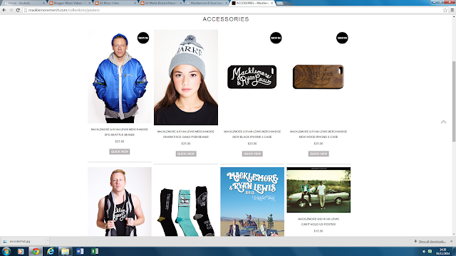
Below I have displayed some of the items of merchandise we have designed for Encoded. We chose to come up with these sorts of merchandise after investigating how some similar artists and bands like to advertise there act and make themselves more appealing to there desired audience. On this occasion we chose Macklemore and Ryan Lewis to observe (a two piece american hip hop band, who we are big fans of). Despite taking inspirations from some of there merchandise themes we did not want to completely steal there ideas and wanted to challenge the conventions of perceived media products by designing our own. We therefore came up with our own design T shirts, hats bags etc displayed below. These are to be made available on our website as well as on sale at our live shows in order for our fans to be able to access them easily.
Macklemore and Ryan Lewis' Merchandise page


Encoded Photoshoot

Today we undertook our final photo shoot as part of our marketing campaign. We took a selection of images using contrasting lights and poses. To capture the images we used a Samsung Galaxy X camera which allowed us to capture some very high quality imagery. Below is a selection of the Photos taken after some editing using Photoshop software.


Website Planning and Construction

Website Planning and Construction

In order to help raise the profile of the band and contribute to the accessibility of the group during the marketing campaign we have produced a website accessible to the fans and the public.
Each Page of the website has been designed very specifically to tie in with the desired themes of the group as well as to make them as appealing as possible. Below I have highlighted each stage of the planning and design process as well as the constructions that have taken place. We used the website design program 'WIX' to construct our actual website domain and area. This program allowed us to achieve the exact plan that we desired after doing some further research into the program to uncover the various features it had to offer. As you can see further down during the construction stage this was highly beneficial.
Immediately below is the very first designs that we came up with on how exactly we wanted our website to be layed out. Although it lacks any aesthetic color plans we wanted to stick to the them of our crisp,bold, black and white color scheme. Each page has each feature clearly labeled as well as some of the content that each of these shall include.

Home Page

The first homepage design seen here includes various feature to make it appeal to our fans. After studying the Arctic Monkeys website which we took a huge amount of inspiration from for our own, we wanted to make the home page very bold and clear so that a user/ fan can clearly see links to each area of the website, and make it easier for them to locate the link that they desire. One of the most important features that we came up with is the countdown clock, which makes it into the first actual construction of the website. We thought that this interactive moving feature would really bring the home screen to life.


     As you can see below not all of the original design made it into the first construction of our website. First of all we kept the top menu bar almost exactly the same as can be seen above. We also included the countdown bar in the same location, However we decided after playing around with different ideas to scrap the side pictures and use one of  our best posters as the background for the hole website, this picture as seen below is black and white edited so it sets the tone and the encoded theme for the rest of the website. We also decided to add more information to that of just the band and tried to turn it into more of a news feed similar to that of the arctic monkeys which can also be seen below as a comparison.


Arctic Monkeys News feed style home page...


Band Page

 The second page of our website is titled the band page. On this page we wanted to give a little bit of background information about the band and there personal life. We did so as we felt that it would give an insight in to there lives and make a personal connection with fans as we are a new fresh group starting out.
  As you can see we originally planned a very basic page with info and in depth background on the personal lives of the band. We also wanted to carry over the same menu bar and countdown clock to make this a constant throughout the website.


  However we quickly realized  during the construction of the website that this would not be enough to fill up the page, therefore to the right of the bold biography box we have added a live link to our instagram page which displays any of the current pictures that the group are uploading. This is also comes with a URL touch link which allows you to jump straight to the instagram website if so desired.


Gallery Page

Next up we have the gallery page which on paper was always going to be the most simple page on the website as we wanted the images to speak for themselves. We have achieved this by keeping the page extremely simple with just the slide show of images in the middle of the page with the same background and menu bar at the top. This as can be seen below was not on the original first draft draw up however we felt that it would be too bare without this. We therefore added these features to fit the theme of the rest of the website whilst also adding more depth to the page.


Here we can see the gallery webpage as it stands after the first construction. It really conveys the crisp structure of the hole 'Encoded brand' as such. We also plan to add many more pictures and images into the gallery than there is as it stands. This will take place after another photo shoot which we have planned in the near future.


UK Tour Page
The next page on our original plan was that advertising our first UK tour to promote our debut album 'Open Spaces' and the first chosen single 'Call me Ishmael'. At the group meeting we discussed this as being one of our crucial pages and that we wanted to make it stand out. We did this by linking the album in with the countdown clock which is present throughout the website counting down to the release date of the album. When asking people there opinion on the website first construction this was one of there favorite features (see website feedback post).


Only a couple of fundamental changes were made from the original plan to the first construction. Once again we added the standard menu bar at the top of the page to accompany the title and countdown. Also we added the video announcing the Tour which is really now the focal point of the page. It also plays automatically when you navigate onto the page so it draws the viewers attention in straight away which is a real benefit, almost acting as an automated advert system. The video can also be found on the home page further down the news feed style area.


Contact Us page
This was the final page that we planned in the original meeting and draft. It consisted of an area by which members of the public could get in direct contact with the band and make us feel a very like able and approachable act. This is important when starting out as a new music act as it helps to gather support quickly, backing this up with our accessibility on social media we believe it will help to kicks start the group on the right foot with the fans,


The original plan was pretty basic on paper but the structure once again coupled with the crisp and professional finish using the wix software help to create another very easy using stylish looking page. The only changes were the adding of the top menu bar and the countdown clock. As you can see below the final style was very effective.


After completing these parts of the website we felt that it was necessary to add some more pages to the website in order to make it complete. After researching some other websites as well as our older research pages we decided that we needed to add a page of information on the album and also a shop/ merchandise area on the site.

Album Page 
We decided to insert a page specifically on 'Open Spaces'. We felt that it was such a big part of the project that it needed it's own area specifically on the website for fans to access. As I said earlier we also linked it in with the countdown clock which was an extremely popular feature with some of the early feedback we received. After researching further into album pages on various websites we found that it was a popular feature throughout many artists websites. For example, the Kasabian website which can be seen below, has a page dedicated to all of there albums.


Although we took inspiration from including the album page we did not want to base the design of the page around any of these pages as we wanted to make it completely unique and themed with the rest of the website. This was the following design that we eventually made and came up with. As you can see its sits with our theme, including a picture of the album cover as well as some bold information about the album and its release.


Shop Page
The second and final page we decided to add was our shop and merchandise page. We found that this was an ever present theme throughout every website that we visited. We therefore decided that it was essential to incorporate this into our site. Some examples of inspiration can be seen below as the merch section of size records website and the shop section for kings of leon site.


Once again we wanted to source our own design into the page rather than taking any design inspiration from current sites. The other key factor to consider is that we are going to add plenty more merchandise once produced to the section as the current supply is very minimal and we will certainly be improving this as soon as possible.

Website Progression - Contact us page

This is the contact us page on our website. This page contains a box where fans or critics can write to the band and tell them what they think of the album. This is the most incomplete page as it contains alot of blank empty space to either side of the picture. Also the countdown is at 0. This is very bad as it will not help to build up hype for the album.

Website Progression - Tour Page

This is the tour page on our website. It contains a poster showing all of the tour dates and venues that Encoded will be playing in. The countdown to the album is also featured to build up hype to the Album being released.

Website Progression - Gallery Page.

This is the gallery page on our website. It contains all of the best photos from our various photo shoots. It also contains that countdown. This is a continuous theme throughout all of the website as we want it to create hype.

Website Progression - Album Page

This is the 'Album' page on our website. This page is basically and advert for thew album and to tease people about what is will be like. The song names are featured on this page. This is most incomplete page on the website and needs alot of work done on it to be up to the standard that the we are aiming for on this website.

Website progression - Band Page.

This is the 'Band' page for our website. This is a page that contains lots of information about the band. The information is mostly background information about how the band came about and how they were signed. It also talks about there influences and there home town.

Website Progression - Homepage

This is the Homepage for the Encoded Website. Out of all the pages on the website this is the most complete page. The two pictures are the best 2 photos that we have been able to make from the photo shoot. The information is a very basic amount of information and there is allot more information on the 'Band' page. The countdown in the top left of the screen is the best feature on the page. It is very eye catching and will help to build up hype for our upcoming album. The countdown was the most popular feature in the feedback we received from our peers. Due to this fact we decided that it should become a prominent feature throughout the website and so it was put on every page.

Wesbite Feedback.

Encoded:

WWW - really like the countdown idea in the top right. A good amount of pages with relevant information and picturesEBI - in my opinion, I feel like the font could tie in with the genre and conventions of 'Encoded' a little bit better

Encoded: The website looks professional, like it could be a real artists website. A good amount of pages and the information is well written and pictures are good. I like the transitions as you change from page to page. Would be even better if the social media links at the bottom of the page actually took you to the artists social media accounts. 

 The website is very catching as soon as you enter the pageLinks are all clear in the page, but links at the top could be missed as they are small and vanish as soon as you scrollTwitter links are good

Encoded:WWW - Really like the countdown idea in the top right. A nice amount of pages with relevant information and pictures. Information spread across pages evenly. EBI - The font could tie in with the genre and conventions of 'Encoded' a little bit better, maybe spray paint or stencil effect? 

Encoded:WWW - I love the countdown widget and the colours fit the genre. The pictures featured are really good and the tour dates are believable.

EBI - Spelling mistakes on 'Band' page need to be fixed.The website is quite standard. Without being mean nothing really stands out at me. When it comes to their website i feel that they need to look into different designs and layouts for their photographs etc. This website does not include any merchandise of any kind. This makes the website look very unfinished and unprofessional. Even though these problems need to be addressed i do however like the contrast of white on black for the themes of the website. This makes the writing stand out and is very eye catching i also love the countdown they have put onto the site. I think this is a great idea for them. In conclusion all they need to do is play with the design and make some merch.

The website for Encoded is also sleek and contemporary. I think that the overall design is appropriate and effective for the Indie/Rock vibe, as it is somewhat reminiscent of groups such as Arctic Monkeys. The site features a few more links than Grace Starr, including contact; there is also a countdown gadget for the album release, which is often found in such websites to promote and create hype for the release.Score: 10/10  

EncodedThe definitive highlight of the Encoded website is the countdown at the top right of the homepage. It is something unique as I haven’t seen anything similar in previously analysed website and is something they will make the website stand above others. However, the colour scheme is a little bland (though that is the general theme of the album) but could use a little livening up. Some of the other webpages are also unfinished however which is the main issue. 

Encoded:WWW - I love the countdown widget and the colours fit the genre. The pictures featured are really good and the tour dates are believable. Spelling mistakes on 'Band' page need to be fixedWhat’s Good:The design and layout of the website if great, i also like the consistency throughout the publications ( the cloud background on the tour poster etc) The way that the pages change is really nice aswell. The Countdown is cool, but what is it for? a tour? a gig? a meet and greet?

Even Better If:Your menu worked correctly, having issues getting back to the home page / band page once i have moved on from them. Double countdown on the album page? would be better if the random one to the left hand side of the screen was removed. The pictures in the gallery don't seem to fit properly, text is cut of, top of heads etc. the countdown on the contact page isn't doing anything...

I like this website as it is very minimalistic and only shows what’s important. This website does however need some tweaking as some of the links don’t work and sometimes you can’t get to the homepage which needs to be fixed. I like the countdown and thin k it is a very good feature and makes it stand out.what went well - the countdown on the homepage is a great widget. the colour scheme of the website matches the photos well.

even better if - there are obvious and consistent grammar errors on the 'band' page which need to be fixed. there is a countdown that is already at 0 on their 'tour' page.This website has some very good pitcures on it, they have edited them well and the timer that they have in the top corner which is counting down to their album being released is also very clever. 

They seem to have forgotten to actually really promote the band because they havent really put any text in this website. They havent mentioned enough about themselves for people to understand about the band. Also on the page for tour they have got a clock countdown on the page and another one in the top corner which is not needed it just looks stupid.  The idea of the countdown is quite good it give the audience something to look forward and to and be excited about. The tour venues are related to the 02, mostly which they have stated the band is linked with which shows good continuity. The Grammar does not make sense on the home page, there is a close of bracket but no open. Also there is a link to home at the top that does not go to anything.

 By far I feel that this website has the best little unique touch to it. My favorite part of this website is the countdown clock until the album is released. This looks really professional and is such an easy thing to include, however looks great. I also really like the simplicity but yet again the effectiveness of the layout, and they website is easy to follow around to different pages. The website however is lacking merchandise which would give it that extra marks I feel and maybe putting some more up to date images of them shooting the music video.


This is the feedback we received from the Website analysis that was carried out by our peers. We feel that this constructive criticism was very useful as it pointed out lots of little things that were wrong that could easily be fixed to make the website more complete and generally better.

Website plan


This was the very first rough draft for our website. We worked in a group and brainstormed roughly how we wanted the website to look. This is what we came up with. Now that we look back on this after we have created the website we have managed to get the website very close to the original plan. Also has a group we are happy with how the website turned out.