Question 2: How effective is the combination of your main product and ancillary texts.
In order to show a quickly show you an overview of all the media texts i have created this short Powtoon to show them all together and to introduce links between them.
When we were creating the Encoded group we focused heavily on creating a continuous brand throughout all of our products. We wanted all of our products to be clearly distinguished and people needed to know they were Encoded just by looking at them. To achieve this we used lots of brand Establishment techniques such as, iconography, similar style photographs and a consitant style throughout.
The look we aimed on all our products was a modern indie look. The look is also commonly used by rock band such a the Arctic monkeys. This is very true for the website. We took alot of our website inspiration from the Arctic Monkeys website.


This Gif outlines the black/white/grey theme throughout our products.
Another ancillary text we made were a our social media pages. The Encoded Group as a Twitter, Instagram, Photobucket, YouTube. All of these are places that fans and our audience. For these reason we feel that it is very important to us similar iconography throughput all of these things. We have used our iconic Black/White photo throughout all of these.
 This is the Encoded Twitter page. The Profile picture is our favorite poster that we have and features alot in most of our Online Presence.

This is the Encoded Sound cloud. As the shown the Profile Picture also follows a clear Black and White theme. This Synergy can be seen across alot of our online presence.
All Social Media outlets are used for very different reasons. They have different strengths and weaknesses. The purpose of Social Media is for artists to reach the mass market and advertise things for the group.
Instagram: This platform allows you to easily share photos and information. We have uploaded many of our best photos from the various photo shoots we have been on. It also allows people to comment on the photos and give feedback on what they think.
Twitter: We mainly use this to advertise upcoming events and communicate with other artists and fans.
Sound cloud: Sound cloud is a very good platform that we use to upload new music to see how it is received. We use it to try out new sounds and songs.
We then implemented links into our other platform such as our website, Twitter and Instagram.

 The performance was the key part of our music video. We new this so we spent time creating the large Encoded sign to subtly reinforce the Encoded brand.

This is a small section of the website. As shown the Encoded name/logo is prominent to reinforce the brand.
 After we had done this in other products we wanted to continue the logo theme so we implemented it into our Digi pack. We made it bigger than the name of the song because as we are only just starting it is important to make a clear brand in the competitive music industry.
Research.
This presentation shows some of the research we carried out when we first started the project. It is about cross media synergy. We know however this does not directly apply to our genre of music but it is a very good example of cross media synergy.
The look we aimed on all our products was a modern indie look. The look is also commonly used by rock band such a the Arctic monkeys. This is very true for the website. We took alot of our website inspiration from the Arctic Monkeys website.
The Arctic monkeys uses this black and white colour scheme to allow people to focus on the information provided, we liked this idea so used this inspiration for our won website.
We went through many different plans and themes before settling on this final designs. We thought that the black and white theme was the best that we found. We like the stylish look that it gave our band and also the emphasis it places on the images used.
Synergy.
We carried out research in the industry and how well established groups and artists make there marketing campaigns. We found:
- Good marketing campaigns use consistent imagery throughout all of there products.
- The font should be consistent throughout all products.
- The colour scheme should be very easily recognisable.
It is very important for an up and coming band to create a brand from the few products they have. The Music industry as very tough competition so in order to stand out from already well established artist you have to make sure that your marketing campaign becomes established and stands out from the crowd. We created this clear black/white/grey brand and. All of this really helps to boost sales by creating a clear brand identity and also makes a memorable product for the audience. The website also shows the video which is a very good way to advertise the video also it is below the line advertising.
This Gif outlines the black/white/grey theme throughout our products.
Another ancillary text we made were a our social media pages. The Encoded Group as a Twitter, Instagram, Photobucket, YouTube. All of these are places that fans and our audience. For these reason we feel that it is very important to us similar iconography throughput all of these things. We have used our iconic Black/White photo throughout all of these.
This is the Encoded Sound cloud. As the shown the Profile Picture also follows a clear Black and White theme. This Synergy can be seen across alot of our online presence.
All Social Media outlets are used for very different reasons. They have different strengths and weaknesses. The purpose of Social Media is for artists to reach the mass market and advertise things for the group.
Instagram: This platform allows you to easily share photos and information. We have uploaded many of our best photos from the various photo shoots we have been on. It also allows people to comment on the photos and give feedback on what they think.
Twitter: We mainly use this to advertise upcoming events and communicate with other artists and fans.
Sound cloud: Sound cloud is a very good platform that we use to upload new music to see how it is received. We use it to try out new sounds and songs.
We then implemented links into our other platform such as our website, Twitter and Instagram.
Style and Brand identity.
Whenever you see the band we carefully thought about costumes and always tried to dress to 'Indie conventions'. We had 'costumes' which were pre agreed upon by the band so we new what they would wear. Style is another good way to create meaningful synergy between the different products. Alot of people take alot of pride and interest in fashion so it is important to use this to your advantage. By focusing on costumes you create a very noticeable brand identity for the brand.
We wanted to look the same in the video, the website and on or social media.
Logo
We have not got a set logo but throughout all of our products we have used the Encoded name as a form of logo.
This is a small section of the website. As shown the Encoded name/logo is prominent to reinforce the brand.
Colour scheme.
Throughout alot of the Encoded products there is a black and white or dark colour scheme. Because we have 2 male artists we wanted the look of the group to be masculine. To achieve this however we did not want to use the generic blue colour. This has been used before in alot of campaigns and when we were doing our research we all really like the black and white colour scheme. The music video is the most colourful media text that we have created. The song is upbeat so it would not work to have it in black and white. Because of this we used coloured light to illuminate a dark room so that we still have the black backdrop to fit with the Website and the Digi Pack.
Font
As shown above the font for the Website is very similar to the font we used on the sign. We modeled the sign on the font on the website as we focused heavily throughout the task on synergy. We feel that this bold white font signifies strength as it is very bold and in your face. This was what we wanted to achieve as we are a masculine group. As well as this we have a black and white theme throughout the entire campaign.
Iconography
 When you are thinking about brand identity you need to choose one piece of iconography that will underlie all other things. For some artist this could be fashion sense or a unique hair cut. For example for the Arctic Monkey Alex Turners 50's hair style is prominent in alot of there marketing.
In Encoded we wanted to focus on something that we could easily use throughout all of the different stages of filming. For this reason we ended up deciding to use a Mis en Scene to create iconography. We focused on the Costumes. Sam Cook (The Guitarist) can be seen wearing the same red unbuttoned shirt in the Performance section of the video and in the outdoors sections. Also Sam Cook is rarely seen in the video without the Guitar. This guitar was a heavily featured prop throughout the entire video and is also a piece of iconography that underpins other key marketing features.
Font
As shown above the font for the Website is very similar to the font we used on the sign. We modeled the sign on the font on the website as we focused heavily throughout the task on synergy. We feel that this bold white font signifies strength as it is very bold and in your face. This was what we wanted to achieve as we are a masculine group. As well as this we have a black and white theme throughout the entire campaign.
Iconography
In Encoded we wanted to focus on something that we could easily use throughout all of the different stages of filming. For this reason we ended up deciding to use a Mis en Scene to create iconography. We focused on the Costumes. Sam Cook (The Guitarist) can be seen wearing the same red unbuttoned shirt in the Performance section of the video and in the outdoors sections. Also Sam Cook is rarely seen in the video without the Guitar. This guitar was a heavily featured prop throughout the entire video and is also a piece of iconography that underpins other key marketing features.

Question 4: How did you use media tehcnologies in the construction and research, planning and evaluation stages?
There where multiple effects that we used on Premiere to achieve the way the video looked. We wanted the video to have a different look to it. To achieve this we filmed in two different locations and mixed the shots in. The cuts between locations where subtle and worked well so although there is an obvious jump it makes sense. To achieve this we often cut on the beat of the song. We made sure the effect we used were to improve the quality of the video so we often added effects to
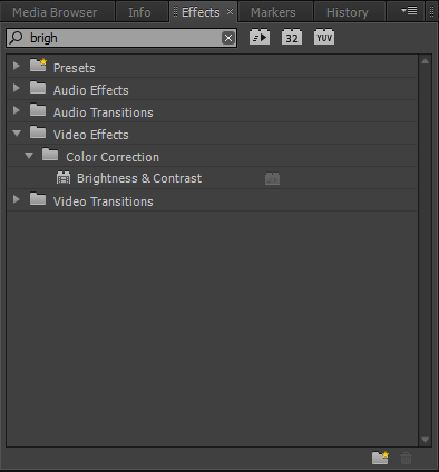

From the image above you can see how different the brightness made shots look. What was good is that Premiere allows you to finely adjust the brightness so that you can never make the light look artificial.
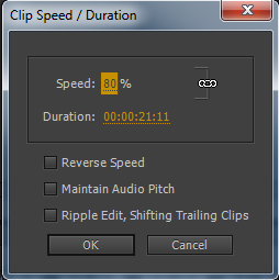
The next effect we used was the speed and duration tool. The reason we used this was because there were moments throughout our live performance were the lighting was really nice and we wanted to have more focus on the lights. Because we wanted to make the lights last longer we slowed them down so that they lasted long enough. But we made sure the slow mo wasn't noticeable.
The main effect in our video was the mirror effect towards the end of the video. There were many layers to achieving this effect. The first was layering two identical videos on top of each other.

Once i had done this I horizontally flipped one of the layers. This meant when i went to crop them later it would create the mirror effect.
Finally i had to crop both layers by 50%. This would mean that the videos would be cut perfectly in half. Because the horizontal flip when the videos are put together it created the mirror effect.

The above picture shows exactly what effects were added to the layers. The image below shows the effect it created. Because the clips are identical they play at the exact same time thus creating the mirror effect.

Finally to touch shots up at the end of the final edit we used a tool called three way color corrector as you can see displayed below. This allowed us to slightly enhance some of the colors in the video. We specifically focused on the red in the live performance as it would make Sam shirt stand out among the lights. This makes the final edit more chrisp which is why we wanted to add it at the end. Without this some shots would look bland and boring and that is not what we wanted.


Encoded 2nd draft.
When we finished this video we thought this would have been the final video. However to make sure that the video was the standard that we wanted it to be we carried out one more evaluation session to get people to be very 'picky' with the video and find out anything at all that could be improved. This was very helpful because it pointed out to us certain things that need to be changed for example in one of the shots the main Encoded sign was the wrong way around because the shot had been flipped. The final version of the video is alot more polished than this version and we feel will meet our high standards.
Merchandise
Below I have displayed some of the items of merchandise we have designed for Encoded. We chose to come up with these sorts of merchandise after investigating how some similar artists and bands like to advertise there act and make themselves more appealing to there desired audience. On this occasion we chose Macklemore and Ryan Lewis to observe (a two piece american hip hop band, who we are big fans of). Despite taking inspirations from some of there merchandise themes we did not want to completely steal there ideas and wanted to challenge the conventions of perceived media products by designing our own. We therefore came up with our own design T shirts, hats bags etc displayed below. These are to be made available on our website as well as on sale at our live shows in order for our fans to be able to access them easily.
Macklemore and Ryan Lewis' Merchandise page

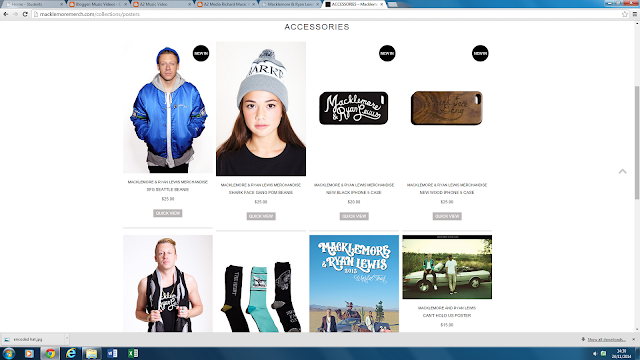
Macklemore and Ryan Lewis' Merchandise page
Evaluation Questionaire.
This is the questionnaire I have to designed to gather feedback and information of people opinions on the Video and digipack. It is quite simple as most of the target audience which I am going to be sampling are non media students who may not necessarily understand the media terms and texts to the level that media students would. For feedback on the website I am going to produce an online interactive survey monkey to make the questionnaire a bit more exciting by using technological innovations.

Halfway Presentation.
Here we have the presentation that we delivered to the class at the half way stage of our project. Please only watch from 00:00 to 6:34 as this video also contains the other presentations from the class.
Amended Digipack.
After reviewing the feedback from our original Digi pack we have made a few changes based on the comments we received. The main changes were the background in a couple of our slides, we made the cloud background darker and changed the font to white so that it was easier to read and didn't get lost in the original light background.
Below is our new amended digipack to be released with the album as part of our marketing campaign for 'Open Spaces' ...


Subscribe to:
Comments (Atom)